 |
 |
 |
 |
 |
 |
| |
 |
|
 |
 |
 |
  |
  |
 |
 |
 |
 |
|
|
 |
|
 |
 |
 |
BUILDING |
 |
|
 |
|
 |
 |
 |
| |
 |
| 
 |
MOE Head Office
|
|
 |
 |
 |
 |
DESIGNER |
 |
|
|
 |
|
 |
 |
 |
| |
 |
|
 |
 |
 |
 |
DESCRIPTION |
 |
|
|
 |
|
 |
 |
 |
|
|
 |
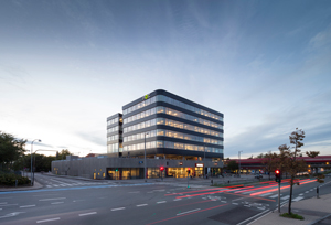 schmidt hammer lassen architects has designed a significant and sculptural new building that connects Buddinge centre in the infrastructural intersection between Buddinge station, the road of Buddingevej and a future light rail. The area is part of Gladsaxe municipality’s urban strategy to intensify built-up areas, which has made it possible to develop a tall and dense building on the site. schmidt hammer lassen architects has designed a significant and sculptural new building that connects Buddinge centre in the infrastructural intersection between Buddinge station, the road of Buddingevej and a future light rail. The area is part of Gladsaxe municipality’s urban strategy to intensify built-up areas, which has made it possible to develop a tall and dense building on the site. |
|
 |
 |
 |
|
 |
|
| One long spiral staircase
|
 |
|
 |
 The central location in Buddinge was ideal for a corporate headquarters, and schmidt hammer lassen architects has worked closely together with MOE during development of the project. The central location in Buddinge was ideal for a corporate headquarters, and schmidt hammer lassen architects has worked closely together with MOE during development of the project.
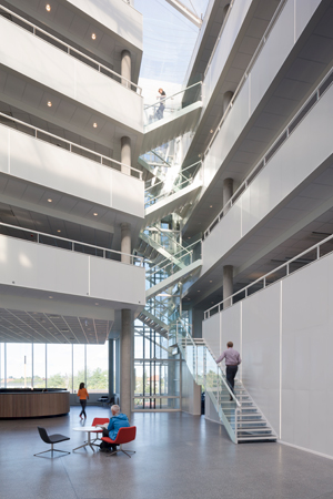
 ”For MOE, it was important that the spirit of the building supported their corporate brand. Already from the first sketches, they talked about dynamics and synergy. From there, came the idea of a long spiral staircase all the way up through the building levels, so the building in itself encourages movement,” states Kristian Lars Ahlmark, partner at schmidt hammer lassen architects. ”For MOE, it was important that the spirit of the building supported their corporate brand. Already from the first sketches, they talked about dynamics and synergy. From there, came the idea of a long spiral staircase all the way up through the building levels, so the building in itself encourages movement,” states Kristian Lars Ahlmark, partner at schmidt hammer lassen architects.
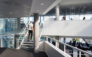
Instead of designing a classic atrium building, schmidt hammer lassen architects proposed a Yin Yang shape, where two building volumes are staggered and at the same time interlocked. The idea of the building as an atrium with an active staircase was taken to the extreme. The building itself became one long staircase where the working areas are placed on what look like oversized landings.
“The result is an office building with displaced levels linked by two staircases, where you use the staircase to move from one floor to the next without landings. Instead of having four to five levels we end up having nine levels but with a leap of half a storey at a time,” Kristian Ahlmark explains. |
|
 |
 |
 |
|
 |
|
|
|
 |
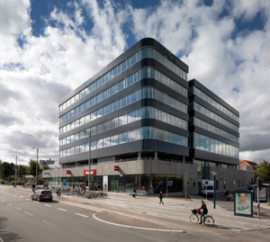
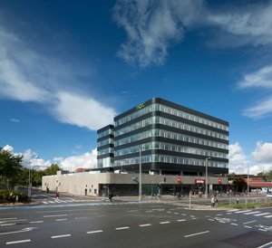 Besides the function as an office building, the development also consists of a base in light grey concrete with a shopping area of approximately 4,000 square metres at ground floor level, connecting to parking areas in the two subterranean levels and on the roof. The two-piece office building sits on top of the base with five east-facing and four west-facing floor levels. The facade is clad in a black ceramic brick tile. Besides the function as an office building, the development also consists of a base in light grey concrete with a shopping area of approximately 4,000 square metres at ground floor level, connecting to parking areas in the two subterranean levels and on the roof. The two-piece office building sits on top of the base with five east-facing and four west-facing floor levels. The facade is clad in a black ceramic brick tile.
The dynamic line of the building continues in the interior design and decoration, also designed by schmidt hammer lassen architects. |
|
 |
 |
 |
 |
 |
 |
 |
ECO-SUSTAINABILITY |
 |
|
|
 |
|
 |
 |
 |
|
|
 |
 The office building is pre-certified as DGNB silver and meets the requirements of the Danish 2015 energy classification. The energy-optimizing measures in the building include high-insolating windows, heat recovery and 300 square metres of solar cell panel on the roof. The DGNB certification also includes measures regarding accessibility and bicycle parking. The office building is pre-certified as DGNB silver and meets the requirements of the Danish 2015 energy classification. The energy-optimizing measures in the building include high-insolating windows, heat recovery and 300 square metres of solar cell panel on the roof. The DGNB certification also includes measures regarding accessibility and bicycle parking. |
|
 |
 |
 |
 |
 |
 |
 |
LOCATION |
 |
|
|
 |
|
 |
 |
 |

|
 |

|
Continent |
|
 |
|
Nation |
|
 |
|
Region |
|
 |
|
Municipality |
|
 |
|
Town |
|
 |
|
Address |
|
 |
|
|
|
 |
|
Website |
|
 |
|
E-mail |
|
 |
|
 |
 |
 |
 |
MAP |
 |
|
|
 |
|
 |
 |
 |
| |
 |
|
 |
 |
 |
 |
|
TYPOLOGY |
 |
|
|
 |
|
 |
 |
 |
Main |
 |
|
 |
ARCHITECTURE | Buildings for offices and professional practises
Offices
| |
|
|
 |
|
Additional |
 |
|
 |
ARCHITECTURE | Commercial buildings
Shops
Transport buildings and structures
Garages, car parking, etc.
| |
 |
 |
 |
 |
CHRONOLOGY |
 |
|
|
 |
|
 |
 |
 |
Realisation |
 |
|
 |
| 
 |
2012 - 2013 |
|
 |
 |
 |
 |
CLIENT |
 |
|
|
 |
|
 |
 |
 |
| |
 |
| Sophienberg Real Estate Development A/S |
|
 |
 |
 |
 |
DIMENSIONAL
DATA |
 |
|
|
 |
|
 |
 |
 |
| Surface |
 |
|
 |
sq.m. 11,500
offices sq.m. 7,500
shopping sq.m. 4,000 |
|
 |
 |
 |
 |
STAFF |
 |
|
|
 |
|
 |
 |
 |
|
 |
|
Engineering |
 |
|
Interior design |
 |
| schmidt hammer lassen architects |
|
General contractor |
 |
| Myhlenberg – Søren Vangsted Vest A/S |
|
 |
 |
 |
 |
CREDITS |
 |
|
|
 |
|
 |
 |
 |
| |
 |
Photos © Adam Mørk
Text edited by schmidt hammer lassen architects
Courtesy by schmidt hammer lassen architects
|
|
 |
  |
 |
|
|