 |
 |
 |
 |
 |
 |
| |
 |
|
 |
 |
 |
  |
  |
 |
 |
 |
 |
|
|
 |
|
 |
 |
 |
BUILDING |
 |
|
 |
|
 |
 |
 |
| |
 |
| 
 |
Hotel Puerta América
|
|
 |
 |
 |
 |
DESIGNER |
 |
|
|
 |
|
 |
 |
 |
| |
 |
|
 |
 |
 |
 |
DESCRIPTION |
 |
|
|
 |
|
 |
 |
 |
| Hotel Puerta América |
 |
|
 |
 An idea of freedom come true, a gathering space merging different cultures and ways of interpreting architecture and design. A masterpiece that awakens guests’ senses, that breaks the mould by using different colours, materials and shapes. A building that ushers guests into innovative spaces, a bold departure from the usual. In short, a hotel that is unique. An idea of freedom come true, a gathering space merging different cultures and ways of interpreting architecture and design. A masterpiece that awakens guests’ senses, that breaks the mould by using different colours, materials and shapes. A building that ushers guests into innovative spaces, a bold departure from the usual. In short, a hotel that is unique. |
|
 |
 |
 |
|
 |
|
| A unique hotel that invites you to a dream |
 |
|
 |
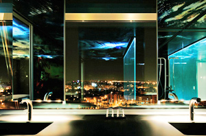 The Hotel Puerta América is a space that invites people to dream - a never-been-attempted-before project that has brought together nineteen of the top architecture and design studios in the world from thirteen different countries. Originality, luxury, innovation and formal freedom define a hotel that awakens its guests’ senses. Each of the floors showcases a different concept in hotel rooms. All play with different materials, colours and shapes to create spaces that bring together the best in avant-garde design and architecture, where creativity and the freedom to develop each of the spaces has been the hallmark. The Hotel Puerta América is a space that invites people to dream - a never-been-attempted-before project that has brought together nineteen of the top architecture and design studios in the world from thirteen different countries. Originality, luxury, innovation and formal freedom define a hotel that awakens its guests’ senses. Each of the floors showcases a different concept in hotel rooms. All play with different materials, colours and shapes to create spaces that bring together the best in avant-garde design and architecture, where creativity and the freedom to develop each of the spaces has been the hallmark.
The Hotel Puerta América is, in short, an eclectic, daring space that does not sell comfort short. Rooms with luxury in their finest detail that entice guests to search for new forms, to interact with them, to touch, to see, and even to breathe and smell... In short, to utterly enjoy a unique space that stands out especially for its quality and wide range of services.
The concept of the Hotel Puerta América emerged from Hoteles Silken mission to create a hotel that was unique, merging different ways of seeing architecture, design and art. The group has put intensive time and energy into the build over the past three years, not to mention investment – estimated at 75 million euros. The area, more than 34,000 square metres, is designed to play host to people from different nationalities and cultures. Everyone involved embarked on an ambitious idea whose very ethos was to become a meeting point, with creative freedom as a banner. All the floors boast the same layout, with a central lobby upon exiting the lift, and a hallway which leads to rooms on either side.
The goal was to offer a space where each of the architects could reflect the best of him or herself, of his or her work, and in many cases of his or her culture and way of viewing the world through architecture and design, and also through photography and literature. The Hotel Puerta América is a colossal accomplishment, a sacrifice spanning several years and on which at times more than 650 people were working at the same time in order to realise this unique work of art. Finally, the dream has come true, thanks to the minds, souls and hands of: |
|
 |
 |
 |
|
 |
|
| Jean Nouvel |
 |
|
 |
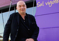 The French architect was commissioned to design the façade, the penthouse and the twelfth floor, which boasts twelve suites. In the latter space he blends photography (lining the walls with images of women and flowers) and architecture to achieve a highly provocative space ideal for “experiencing exceptional moments”. The French architect was commissioned to design the façade, the penthouse and the twelfth floor, which boasts twelve suites. In the latter space he blends photography (lining the walls with images of women and flowers) and architecture to achieve a highly provocative space ideal for “experiencing exceptional moments”.
» See dossier 12th floor and penthouse |
|
 |
 |
 |
|
 |
|
| Zaha Hadid |
 |
|
 |
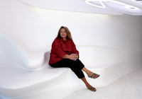 The first woman to win a Pritzker Prize (termed ‘the Nobel of architecture’) has designed the first floor, a space that stands out for its fluidity and interplay of daring lines. The rooms almost seem to be liquid rather than space, where the choice of innovative materials is yet another outstanding feature. The first woman to win a Pritzker Prize (termed ‘the Nobel of architecture’) has designed the first floor, a space that stands out for its fluidity and interplay of daring lines. The rooms almost seem to be liquid rather than space, where the choice of innovative materials is yet another outstanding feature.
» See dossier 1st floor |
|
 |
 |
 |
|
 |
|
| Norman Foster |
 |
|
 |
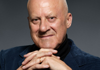 Norman Foster has created a serene environment on the second floor which harbours the guest from the hustle-bustle outside. Leather is the pre-eminent material through which different acoustic and tactile sensations are sought. Norman Foster has created a serene environment on the second floor which harbours the guest from the hustle-bustle outside. Leather is the pre-eminent material through which different acoustic and tactile sensations are sought.
» See dossier 2nd floor |
|
 |
 |
 |
|
 |
|
| David Chipperfield |
 |
|
 |
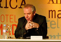 David Chipperfield, on the third floor, proposes a simple yet luxurious space where he combines handcrafted finishes, upholstered panels and white marble. Chipperfield creates a sensation of depth and surprise by paying painstaking attention to colours and lighting both in the lobby and hallways and in the rooms. David Chipperfield, on the third floor, proposes a simple yet luxurious space where he combines handcrafted finishes, upholstered panels and white marble. Chipperfield creates a sensation of depth and surprise by paying painstaking attention to colours and lighting both in the lobby and hallways and in the rooms.
» See dossier 3rd floor |
|
 |
 |
 |
|
 |
|
| Plasma Studio |
 |
|
 |
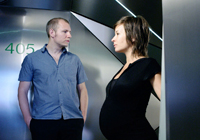 Plasma Studio (Eva Castro and Holger Kehne) is a young studio that is striving to “change the stereotype of a hotel as an anodyne space” through a highly geometrical design for the fourth floor. This is a space that could well come straight out of science fiction. Plasma Studio (Eva Castro and Holger Kehne) is a young studio that is striving to “change the stereotype of a hotel as an anodyne space” through a highly geometrical design for the fourth floor. This is a space that could well come straight out of science fiction.
» See dossier 4th floor |
|
 |
 |
 |
|
 |
|
| Victorio & Lucchino |
 |
|
 |
 Victorio & Lucchino have transformed the fifth floor into a very cosy space inspired by their work in the field of fashion. The design team from Seville uses different types of fabrics, such as linen, and decorates the walls of the rooms with different motifs until achieving a truly welcoming, warm space where the guest feels virtually embraced by the fabrics and colours. Victorio & Lucchino have transformed the fifth floor into a very cosy space inspired by their work in the field of fashion. The design team from Seville uses different types of fabrics, such as linen, and decorates the walls of the rooms with different motifs until achieving a truly welcoming, warm space where the guest feels virtually embraced by the fabrics and colours.
» See dossier 5th floor |
|
 |
 |
 |
|
 |
|
| Marc Newson |
 |
|
 |
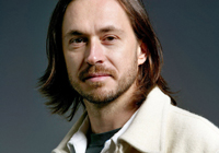 Marc Newson has created two extremely modern, relaxing and sophisticated spaces on the sixth floor and the bar, featuring an interplay of just a few materials. The hallway of the sixth floor is totally of red lacquered wood, resembling a mirror. In the bar, he creates spaciousness in a work boasting a marble bar, a single piece weighing more than six tonnes and measuring 8.25 metres long, and 400 strips of laser-cut aluminium. Marc Newson has created two extremely modern, relaxing and sophisticated spaces on the sixth floor and the bar, featuring an interplay of just a few materials. The hallway of the sixth floor is totally of red lacquered wood, resembling a mirror. In the bar, he creates spaciousness in a work boasting a marble bar, a single piece weighing more than six tonnes and measuring 8.25 metres long, and 400 strips of laser-cut aluminium.
» See dossier 6th floor
» See dossier Marmo Bar |
|
 |
 |
 |
|
 |
|
| Ron Arad |
 |
|
 |
 Ron Arad has organised the space on the seventh floor in a highly provocative, imaginative way, which shows a glimpse into how future hotels could be. He opted to “use the floor space, rather than the walls” to create an internal pathway that gradually reveals each of the spaces within the rooms. Ron Arad has organised the space on the seventh floor in a highly provocative, imaginative way, which shows a glimpse into how future hotels could be. He opted to “use the floor space, rather than the walls” to create an internal pathway that gradually reveals each of the spaces within the rooms.
» See dossier 7th floor |
|
 |
 |
 |
|
 |
|
| Kathryn Findlay |
 |
|
 |
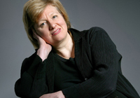 Kathryn Findlay has designed the eighth floor. Her intention was to re-create a meditative space where guests can dream, or as she claims, listen to the wind. The architect barely separates the spaces using white curtains in order to achieve a highly feminine space. On this floor, Jason Bruges, an interactive designer, has worked in conjunction with Findlay to create light installations for the lobby and hallway that react to guests’ movements. Kathryn Findlay has designed the eighth floor. Her intention was to re-create a meditative space where guests can dream, or as she claims, listen to the wind. The architect barely separates the spaces using white curtains in order to achieve a highly feminine space. On this floor, Jason Bruges, an interactive designer, has worked in conjunction with Findlay to create light installations for the lobby and hallway that react to guests’ movements.
» See dossier 8th floor |
|
 |
 |
 |
|
 |
|
| Richard Gluckman |
 |
|
 |
 Richard Gluckman was commissioned to design the ninth floor, where he used materials such as methacrylate in unexpected and surprising ways. His concept is that of ‘a box within a box’. In this way, the space stands out for its orderliness and feeling of lightness and neatness. Richard Gluckman was commissioned to design the ninth floor, where he used materials such as methacrylate in unexpected and surprising ways. His concept is that of ‘a box within a box’. In this way, the space stands out for its orderliness and feeling of lightness and neatness.
» See dossier 9th floor |
|
 |
 |
 |
|
 |
|
| Arata Isozaki |
 |
|
 |
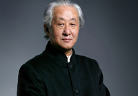 Arata Isozaki provides guests with a subtle, relaxing interior design on the tenth floor, with a clear Japanese influence. The bathroom harks back to typically Japanese traditions, with the wooden bathtub and shower placed together. Also noteworthy is the shoji, a panel reminiscent of this Far Eastern country’s traditional homes. Arata Isozaki provides guests with a subtle, relaxing interior design on the tenth floor, with a clear Japanese influence. The bathroom harks back to typically Japanese traditions, with the wooden bathtub and shower placed together. Also noteworthy is the shoji, a panel reminiscent of this Far Eastern country’s traditional homes.
» See dossier 10th floor |
|
 |
 |
 |
|
 |
|
| Javier Mariscal and Fernando Salas |
 |
|
 |
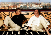 Javier Mariscal and Fernando Salas were determined to provoke different sensations with their graphic design for the eleventh floor. They used a broad palette of colours, especially in the rooms’ floors and walls, in an attempt to convey liveliness and imagination. Javier Mariscal and Fernando Salas were determined to provoke different sensations with their graphic design for the eleventh floor. They used a broad palette of colours, especially in the rooms’ floors and walls, in an attempt to convey liveliness and imagination.
» See dossier 11th floor |
|
 |
 |
 |
|
 |
|
| John Pawson |
 |
|
 |
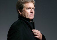 John Pawson was commissioned to design the lobby and meeting rooms. He has attempted to create “a space to encounter peace and quiet in the heart of the hotel”. He achieves this through the use of wood and a design that harbours the reception area in a semi-circle, thus sheltering the guests from the constant motion passing through the area. John Pawson was commissioned to design the lobby and meeting rooms. He has attempted to create “a space to encounter peace and quiet in the heart of the hotel”. He achieves this through the use of wood and a design that harbours the reception area in a semi-circle, thus sheltering the guests from the constant motion passing through the area.
» See dossier Lobby |
|
 |
 |
 |
|
 |
|
| Teresa Sapey |
 |
|
 |
 Teresa Sapey designed the underground car park using a fascinating play of colour and line which “appeals to a person’s emotional side, yet which is at heart functional”. In this way, each floor presents an inter-play of colours, most notably warm tones in the first underground level. Teresa Sapey designed the underground car park using a fascinating play of colour and line which “appeals to a person’s emotional side, yet which is at heart functional”. In this way, each floor presents an inter-play of colours, most notably warm tones in the first underground level.
» See dossier Car Park |
|
 |
 |
 |
|
 |
|
| Christian Liaigre |
 |
|
 |
Christian Liaigre combines different aspects of Spanish culture in the restaurant, with a leather and wood interior that provides a home for high quality cuisine, made from premium ingredients that have been meticulously combined.
» See dossier Lágrimas Negras Restaurant |
|
 |
 |
 |
|
 |
|
| BB UK |
 |
|
 |
Harriet Bourne and Jonathan Bell from BB UK handled the landscape design in the outside garden. The vegetation is designed to reflect the changing season while complimenting the building it surrounds. Indeed, in their opinion, “the integration between vegetation and buildings is fundamental”
» See dossier Garden |
|
 |
 |
 |
|
 |
|
| Arnold Chan |
 |
|
 |
| Arnold Chan, from Isometrix Lighting and Design, was commissioned to design and co-ordinate the building’s lighting scheme, adapted to and supporting the designs of each architect |
|
 |
 |
 |
|
 |
|
| SGA Estudio |
 |
|
 |
| Felipe Sáez de Gordoa (SGA Estudio) developed the design for the structure. With extensive previous hotel build experience, he laid the foundations for the space upon which the other architects and designers have worked. |
|
 |
 |
 |
|
 |
|
| Oscar Niemeyer |
 |
|
 |
One of the greatest architects in history, Brazilian Niemeyer has exclusively designed a sculpture to be placed in the adjacent park. It takes the form of a sickle-shaped work which harks back to the poetic shapes of his best buildings.
» See dossier Sickle |
|
 |
 |
 |
|
 |
|
|
|
 |
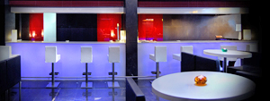 The Hotel Puerta América will undoubtedly become renowned as one of the great five-star luxury hotels. A sensorial and intellectual feast that clearly upholds the maxims of Hoteles Silken in its quest for quality and innovation. Through a space brimming with an array of different shapes, materials and colours, the aim is for the guest to become involved, to discover a new way of experiencing a hotel without sacrificing comfort. The goal is move towards a new concept in hotels, while at the same time creating a new dimension in services and facilities in order to make visitors’ stays more pleasant. The Hotel Puerta América will undoubtedly become renowned as one of the great five-star luxury hotels. A sensorial and intellectual feast that clearly upholds the maxims of Hoteles Silken in its quest for quality and innovation. Through a space brimming with an array of different shapes, materials and colours, the aim is for the guest to become involved, to discover a new way of experiencing a hotel without sacrificing comfort. The goal is move towards a new concept in hotels, while at the same time creating a new dimension in services and facilities in order to make visitors’ stays more pleasant. |
|
 |
 |
 |
|
 |
|
| Structures |
 |
|
 |
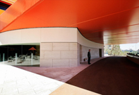 The hotel areas, their distribution and shape, in short, the entire structure of the Hotel Puerta América is the work of SGA Estudio, with Felipe Sáez de Gordoa at the helm. The hotel has two entrances. The main entrance is a raised orange pathway with vehicle entrance right up to the main doors. It is slightly lower than street level on the Avenida de América side of the building, enabling guests to arrive right at the entrance, where the reception deks and the common areas such as the restaurant and bar are located. The back or service access is located on Corazón de María street. “The hotel structure has a characteristic dihedral laminar shape (150o) of fourteen floors, with two adjoining cylindrical bodies on the ground floor: the front (covered entrance canopy) and the back (the meeting rooms surrounded by an outer gallery)”, explains SGA Estudio. The hotel areas, their distribution and shape, in short, the entire structure of the Hotel Puerta América is the work of SGA Estudio, with Felipe Sáez de Gordoa at the helm. The hotel has two entrances. The main entrance is a raised orange pathway with vehicle entrance right up to the main doors. It is slightly lower than street level on the Avenida de América side of the building, enabling guests to arrive right at the entrance, where the reception deks and the common areas such as the restaurant and bar are located. The back or service access is located on Corazón de María street. “The hotel structure has a characteristic dihedral laminar shape (150o) of fourteen floors, with two adjoining cylindrical bodies on the ground floor: the front (covered entrance canopy) and the back (the meeting rooms surrounded by an outer gallery)”, explains SGA Estudio. |
|
 |
 |
 |
|
 |
|
| Lighting Concept for all the hotel areas |
 |
|
 |
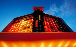 The lighting strategy for this unique hotel comprised two basic components of minimal intrusion to the architecture, with maximum rendering of the space. Our philosophy was to reveal the individual quality and character of each one of the suite floors and public areas of the hotel. This included the introduction, where appropriate, of a set of ‘common lighting elements’, which are characteristic of Isometrix’s approach to architectural lighting. The lighting strategy for this unique hotel comprised two basic components of minimal intrusion to the architecture, with maximum rendering of the space. Our philosophy was to reveal the individual quality and character of each one of the suite floors and public areas of the hotel. This included the introduction, where appropriate, of a set of ‘common lighting elements’, which are characteristic of Isometrix’s approach to architectural lighting.
Starting with the landscape and the exterior of the hotel, the aim was to emphasise the colour of the hotel cladding and highlight selected features of the landscape design, both for amenity and visual interest. The iconic appearance of the hotel is evenly rendered at night with a vibrant palette of colours that glow softly from bright yellow to dark blue. At low level the texture of the walls and screens is accented to expose the boundaries of the hotel’s public realm.
 The interior of the hotel responded to each designer’s requirements and individual approach to the brief. While the restaurant is illuminated using decorative pendants and recessed luminaires to bring intimacy to the ambiance, in contrast, the Hotel bar is rendered with glowing lights behind the aluminium fins and lighting slots along the floor. A slight colour accent is added to the upper aluminium feature, at night and as an extremely discrete feature, in order to avoid disruption to the strong language of materials and forms selected. The interior of the hotel responded to each designer’s requirements and individual approach to the brief. While the restaurant is illuminated using decorative pendants and recessed luminaires to bring intimacy to the ambiance, in contrast, the Hotel bar is rendered with glowing lights behind the aluminium fins and lighting slots along the floor. A slight colour accent is added to the upper aluminium feature, at night and as an extremely discrete feature, in order to avoid disruption to the strong language of materials and forms selected.
The lobby and conference rooms follow Pawson’s philosophy with clean ceilings and walls. The lighting is only present as indirect sources, which highlight screens, entrance points, or circulation spaces. With regard to every level of the hotel, the lighting solutions mainly involved minimum visibility of the light sources, wherever possible. The primary elements of lighting are indirect coves, lighting slots and lighting integral to the furniture elements –crucial to the achievement of high quality in the project.
The choice of lamps was restricted with only light sources with the highest quality, in terms of colour rendition and light output, which are fundamental for the sought level of comfort in a five star hotel. There were few exceptions, where the character of the architecture demanded a different –and sometimes radical – lighting approach. In such cases the lighting is comprised of unusual sources like LEDs and fluorescent lamps. In all cases, the light sources had to be completely invisible and concealed in architectural details to maintain the elegance and discretion that Isometrix aimed for.
The lighting adds and compliments every architectural aspect contained within each expressed floor. The result of the lighting having a unified approach allows the distinct architects of a wonderful combination of colours, textures and dimensions to be materialised in twelve fantastic and unique hospitality environments together under one roof. |
|
 |
 |
 |
|
 |
|
|
|
 |
|
 |
 |
 |
 |
 |
 |
 |
LOCATION |
 |
|
|
 |
|
 |
 |
 |

|
 |

|
Continent |
|
 |
|
Nation |
|
 |
|
Autonomous community |
|
 |
|
Province |
|
 |
|
Town |
|
 |
|
District |
|
 |
|
Neighborhoods |
|
 |
|
Address |
|
 |
|
|
|
 |
|
Telephone |
|
 |
|
Fax |
|
 |
|
Website |
|
 |
|
E-mail |
|
 |
hotel.puertamerica@hoteles-silken.com |
|
 |
 |
 |
 |
MAP |
 |
|
|
 |
|
 |
 |
 |
| |
 |
|
 |
 |
 |
 |
|
TYPOLOGY |
 |
|
|
 |
|
 |
 |
 |
Main |
 |
|
 |
ARCHITECTURE | Commercial buildings
Restaurants
Buildings for travel and tourism
Hotels
Monuments, decorations, furnishings, graphics
Facades and decorative elements
|
LANDSCAPE ARCHITECTURE AND NATURAL ENVIRONMENTS | Landscape architecture
Private gardens
| |
|
|
 |
|
Additional |
 |
|
 |
ARCHITECTURE | Buildings for cultural activities
Congress and conference centre
Conference halls
Buildings for health and well-being
Wellness centre
Transport buildings and structures
Garages, car parking, etc.
Architecture of parklands and water
Private swimming pools
| |
 |
 |
 |
 |
CHRONOLOGY |
 |
|
|
 |
|
 |
 |
 |
Project |
 |
|
 |
| 
 |
2002
|
|
Realisation |
 |
|
 |
| 
 |
2004 - 2005 |
|
 |
 |
 |
 |
AWARDS |
 |
|
|
 |
|
 |
 |
 |
| 2006 |
 |
|
 |
Landscape Institute Award
Best Design under 5 hectares |
|
 |
 |
 |
 |
 |
 |
 |
BIBILIOGRAPHIC REFERENCES |
 |
|
|
 |
|
 |
 |
 |
|
 |
| "Seeing it through", Icon 49, july 2007, pp. 54-56 |
|
|
| "Hoteletage in Madrid/Floor of a Hotel in Madrid", Detail 4/2006 [Licht und Innenraum/Light and Interiors/Éclairage et intérieurs], "Dokumentatio/Documentation" pp. 314-315, 437 |
|
|
| Maurizio Vogliazzo, "19 progettisti/Hotel Puerta America, Madrid", L'Arca 209, dicembre/december 2005, pp. 44-45 (44-67) |
|
|
| Robert Such, "Guest designers", Monument 70, december 2005-january 2006, pp. 26-27 |
|
|
El Croquis 127, diciembre/december 2005 [John Pawson. 1995/2005]
"Vestíbulo del Hotel Puerta América/Lobby, Hotel Puerta América", El Croquis 127, diciembre/december 2005 [John Pawson. 1995/2005], pp. 150-153 |
|
|
| Julia Liese, "Kritisch betrachtet: Designhotel der Superlative - Hotel Puerta América in Madrid/A Critical View: Hotel Puerta América in Madrid - A Designer's Jamboree", Detail 10/2005 [Bauen mit Mauerwerk/Wall Construction/Maçonnerie], "Berichte/Reports" pp. 1082-1083 |
|
|
| Yoshio Futagawa, "New Hotel Designed by World's Leading Architects and Designers. Hotel Puerta America, Madrid, Spain", GA Houses 89, september 2005, pp. 96-111 |
|
|
| David Cohn, "Overnight sensation", Architectural Record 9/2005, september 2005, pp. 96-103 |
|
|
| Marcus Fairs, "'Everybody should really chill out'", Icon 27, september 2005, pp. 51-52 |
|
|
| Catherine Slessor, "Interior finishes", Architectural Review 1302, august 2005, pp. 96-97 |
|
|
François Chaslin, "'Ich bin ein Spanier'/'I am a Spaniard'", Arquitectura Viva 103, VII-VIII 2005 [Valencia 2007], " Últimos proyectos - Técnica / Diseño" pp. 100-103 (100-123)
"Sueños de diseño. Hotel Puerta América, Madrid.", Arquitectura Viva 103, VII-VIII 2005 [Valencia 2007], " Últimos proyectos - Técnica / Diseño" pp. 112-117 (100-123) |
|
|
| Luis Fernández-Galiano, "¿Por qué me siento mal?", Arquitectura Viva 99, XI-XII 2004 [Aragón existe], "Últimos proyectos - Técnica / Diseño" |
|
 |
 |
 |
 |
 |
 |
 |
CLIENT |
 |
|
|
 |
|
 |
 |
 |
| |
 |
|
 |
 |
 |
 |
AMOUNT |
 |
|
|
 |
|
 |
 |
 |
| |
 |
|
 |
 |
 |
 |
DIMENSIONAL
DATA |
 |
|
|
 |
|
 |
 |
 |
| Floors |
 |
|
 |
|
| Number |
 |
|
 |
|
 |
 |
 |
 |
LANDSCAPE DESIGN |
 |
|
|
 |
|
 |
 |
 |
| |
 |
| Harriet Bourne & Jonathan Bell |
|
 |
 |
 |
 |
STAFF |
 |
|
|
 |
|
 |
 |
 |
Project  |
 |
SGA Estudio
Felipe Sáez de Gordoa |
|
|
 |
|
|
 |
|
Facades |
 |
|
Art intervention |
 |
| Oscar Niemeyer (sculpture) |
|
Lighting design |
 |
Arnold Chan
Isometrix Ligthting and Design |
|
 |
  |
 |
|
|