 |
 |
 |
 |
 |
 |
| |
 |
|
 |
 |
 |
  |
  |
 |
 |
 |
 |
|
|
 |
|
 |
 |
 |
BUILDING |
 |
|
 |
|
 |
 |
 |
| |
 |
| 
 |
P10
|
|
 |
 |
 |
 |
DESIGNER |
 |
|
|
 |
|
 |
 |
 |
| |
 |
|
 |
 |
 |
 |
DESCRIPTION |
 |
|
|
 |
|
 |
 |
 |
|
|
 |
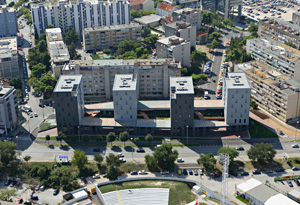
 The P10 mixed-use building houses offices, commercial showrooms, apartments, a public garage and a small archaeological museum devoted to Diocletian Aqueduct that runs through the site. This area was part of an ambitious and romantic postwar study by Berislav Kalodjera that proposed a connective sequence of open public spaces from south to the north of the Split peninsula. The site has since then been regarded as a void operating as a narthex to the sport campus on the north. The P10 mixed-use building houses offices, commercial showrooms, apartments, a public garage and a small archaeological museum devoted to Diocletian Aqueduct that runs through the site. This area was part of an ambitious and romantic postwar study by Berislav Kalodjera that proposed a connective sequence of open public spaces from south to the north of the Split peninsula. The site has since then been regarded as a void operating as a narthex to the sport campus on the north.
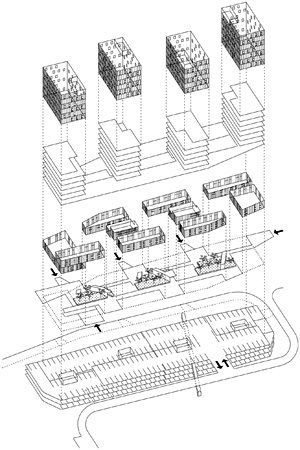
 In our entry to the 2005 open competition we proposed a new typology for the site that follows the precise pulsating rhythm of slabs and towers within Split’s ‘ring.’ The project combines four towers (apartments and offices) that rise up from a retail spiral slab that echoes the romantic idea of the sequence of public spaces by incorporating an internal public route and introducing a series of Mediterranean gardens. The accidental passenger becomes the part of the system. In our entry to the 2005 open competition we proposed a new typology for the site that follows the precise pulsating rhythm of slabs and towers within Split’s ‘ring.’ The project combines four towers (apartments and offices) that rise up from a retail spiral slab that echoes the romantic idea of the sequence of public spaces by incorporating an internal public route and introducing a series of Mediterranean gardens. The accidental passenger becomes the part of the system.
The base volume of lower spiral (ground floor and the first floor) is occupied by public spaces, gardens, commercial spaces and offices. The roof is covered by concrete mosaic tiles only visible from the apartments, which is simulating a garden - illusion with fake dark shadow - as urban lichen.
Flexible unit plan scheme: except the structural core and façade, everything was free. As all the apartment and office space were sold out immediately after the architect won the competition, the excecution design was developed with the residents’ participation. The result is 92 different apartments, all customized, with surround home cinema systems, smart home system, kitchens, bathroom equipments...
The project has some reference points in neighboring modernist buildings on the ring, as a kind of homage to the local master architects. The materials are chosen refered to the architect Ivo Radic who used fibre cement sheets, mediterranean high tech double facade form the local factory (Salonit). The color scheme is refering to Stanko Fabris who designed the polychromic towers with raster facade, and the public passage on the ground floor is a homage for Frano Gotovac’s huge building called Chinese wall. |
|
 |
 |
 |
 |
 |
 |
 |
LOCATION |
 |
|
|
 |
|
 |
 |
 |

|
 |

|
Continent |
|
 |
|
Nation |
|
 |
|
Region |
|
 |
|
Town |
|
 |
|
Address |
|
 |
|
|
|
 |
|
 |
 |
 |
 |
MAP |
 |
|
|
 |
|
 |
 |
 |
| |
 |
|
 |
 |
 |
 |
|
TYPOLOGY |
 |
|
|
 |
|
 |
 |
 |
Main |
 |
|
 |
ARCHITECTURE | Residential buildings
Multiple dwelling
Buildings for offices and professional practises
Offices
Commercial buildings
Shops
| |
|
|
 |
|
Additional |
 |
|
 |
ARCHITECTURE | Museums and buildings for exhibitions
Archaeology museums
Transport buildings and structures
Garages, car parking, etc.
| |
 |
 |
 |
 |
CHRONOLOGY |
 |
|
|
 |
|
 |
 |
 |
Project |
 |
|
 |
| 
 |
2006
project winner of competition
|
|
Realisation |
 |
|
 |
| 
 |
2006 - 2009 |
|
 |
 |
 |
 |
BIBILIOGRAPHIC REFERENCES |
 |
|
|
 |
|
 |
 |
 |
|
 |
| "Studio Up. P10 Mixed-Use Building, Split, Croatia, 2006-09", Lotus International 148, dicembre/december 2011 [New Urban Housing II], pp. 54-57 |
|
 |
 |
 |
 |
 |
 |
 |
CLIENT |
 |
|
|
 |
|
 |
 |
 |
| |
 |
|
 |
 |
 |
 |
AMOUNT |
 |
|
|
 |
|
 |
 |
 |
| |
 |
|
 |
 |
 |
 |
DIMENSIONAL
DATA |
 |
|
|
 |
|
 |
 |
 |
| Surface |
 |
|
 |
site sq.m. 4,500
built-up sq.m. 21,600 |
|
| Consistence |
 |
|
 |
|
 |
 |
 |
 |
STAFF |
 |
|
|
 |
|
 |
 |
 |
|
 |
|
Design team |
 |
| Lea Pelivan, Toma Plejic, Sasa Relic, Marina Zajec, Mojca Smode, Antun Sevsek, Marko Rukavina, Ida Krizaj |
|
Graphic design |
 |
|
 |
 |
 |
 |
CREDITS |
 |
|
|
 |
|
 |
 |
 |
| |
 |
Photos © Robert Les
Drawings © Studio UP
Text edited by Studio UP
Courtesy by Studio UP
|
|
 |
  |
 |
|
|